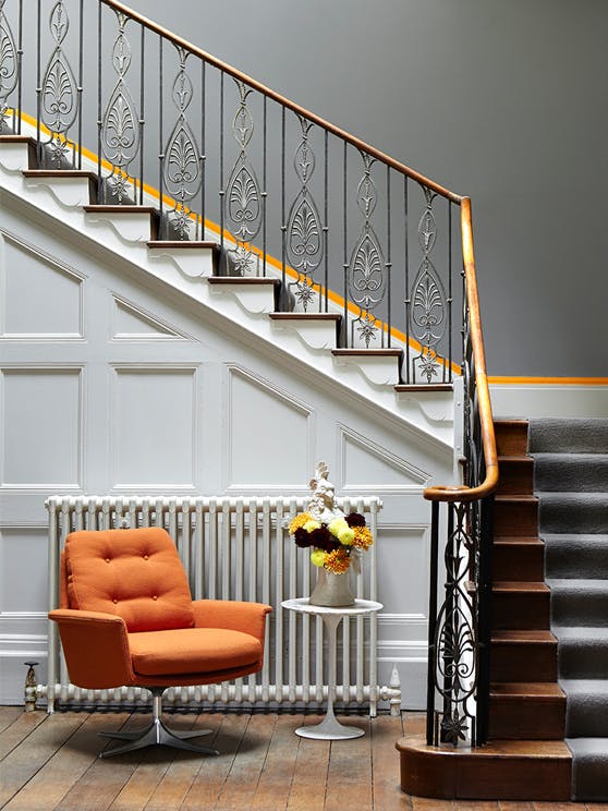
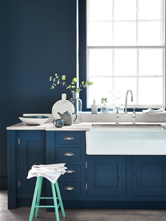
Following the resounding success of ourGrey collection, we have been considering the next chapter in the Book of Colour for the cutting edge interior designer.
We have experimented with different colour combinations from ourColours of England card. We found that with most of us living modern lives in buildings originally designed for completely different lifestyles, there were interesting ways to use our historical ‘neutral colours’, whilst forming the basis of contemporary design schemes; not by changing them but by changing the colours used with them.
These beautiful ‘new’ colour combinations were created using natural earth pigments and often contained black, given a muted quality that is generally associated with what we believe to be ‘true’ historical paint shades, even though this soft quality was frequently the result of aging on the painted surface rather than the authentic, intended hue.
Our ‘Colour Highlights’ were launched at Decorex International in September 2014.
Some notable combinations include:
- Telecom Tower meets Broughton House – The legendary 1960s restaurant colour ‘Hicks Blue’ with the Regency shade ‘Green Verditer’-
- Pure cool grey with a bright streak of 1970s chic – ‘Grey Teal’ with ‘Marigold’
- The popular Regency shade ‘Yellow Pink’ with ‘Lamp Black’ woodwork in place of the traditional favoured off-white
- The charming Victorian colour ‘Sage Green’, paired-perhaps surprisingly, with the ultra-blue ‘Mambo’
- Georgian landscape pioneer Humphrey Repton’s ‘Invisible Green’ with the rather less formal pink ’Leather’ from the 1970’s
For further updates, keep a lookout on our Facebook & Twitter pages!


